Training Management
Creating Certificate Layouts
A certificate layout controls the design of the certificates your organization issues. The layout decides where the student name sits, how large the course title prints, whether a second signature appears, and what shows in the fine print. Certificate templates hold the content, the logo, the signatures, and the notes, while the layout positions all of it on the page.
Layouts are built and edited from the Classes menu by choosing Certificates, then Manage Layouts. This is an organization-level tool available to admins. If you do not see the Manage Layouts button, contact support@prodigyems.com to request access.
Certificate Layouts is in Beta
The layout builder is marked Beta in the platform. It works, and published layouts are used on real certificates, but expect the interface to keep improving. Building a layout means editing JSON by hand, so it takes some technical comfort. If you would rather have help designing a layout, reach out to support@prodigyems.com.
Getting to Manage Layouts
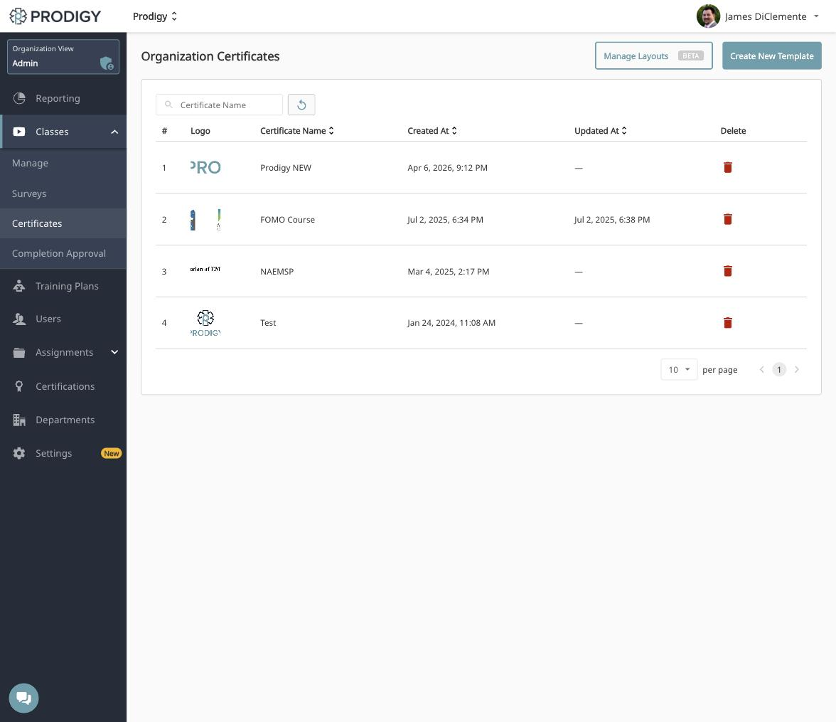
Open the Classes menu, choose Certificates, and you will land on the Organization Certificates page listing every certificate template your organization has built. Manage Layouts sits in the top right, next to Create New Template.
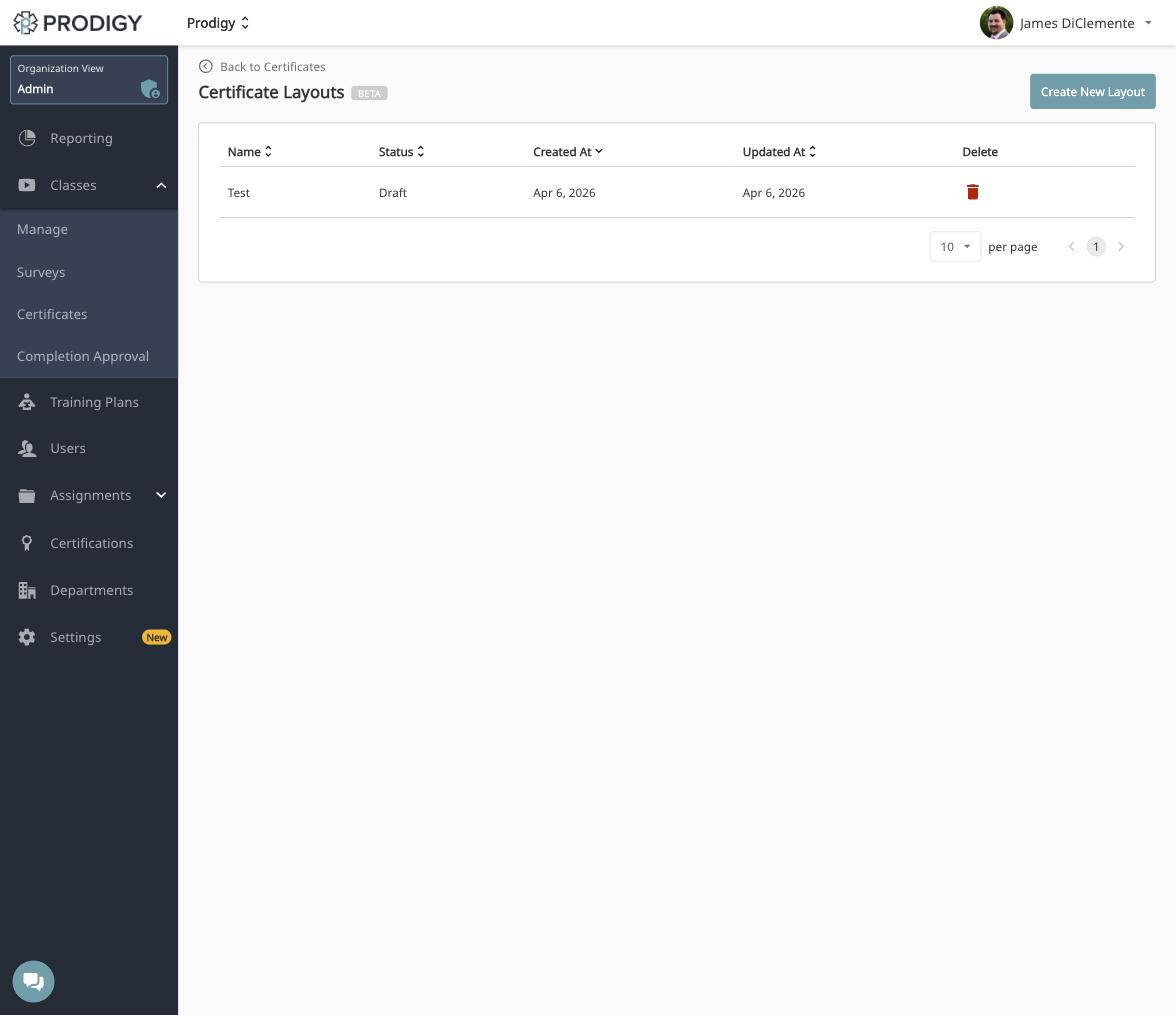
The Certificate Layouts page lists your organization's layouts with their name, status, and the dates they were created and updated. Click any layout name to open it for editing, or choose Create New Layout to start a new one.
Publishing a layout
Layouts save in Draft status, and a draft is not available on certificates. Saving your work does not change any certificate your organization issues. When a layout is ready to use, contact support@prodigyems.com and we will publish it for you.
Building a Layout
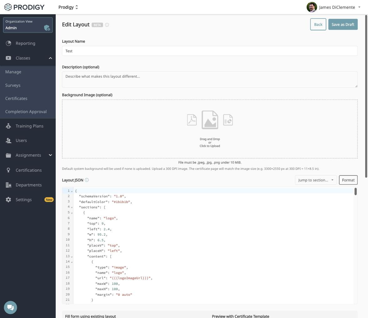
The layout editor has four parts: the name and description, the background image, the layout JSON, and the preview.
Layout Name and Description
The Layout Name is how the layout appears in the layout list and in the Certificate Layout dropdown when you build a certificate template, so name it for what makes it distinct rather than for the course it happens to be used on. The Description is optional and is a good place to note what sets this layout apart from your others.
Background Image
The Background Image is optional. If you do not upload one, the default system background is used. Uploads must be .jpeg, .jpg, or .png and under 10 MiB.
Upload a 300 DPI image, because the certificate page matches the image size. An image of 3300 × 2550 pixels at 300 DPI produces the standard 11 × 8.5 inch landscape certificate.
Design elements belong in the background
Borders, decorative frames, watermarks, seals, and color blocks are all part of the background image. The layout JSON positions text and images only, so anything decorative has to be baked into the file you upload here.
Layout JSON
The Layout JSON editor is where the positioning lives. Two tools sit above it: Jump to section opens a searchable list of the sections in your JSON and scrolls the editor to the one you pick, and Format cleans up the indentation of the whole document.
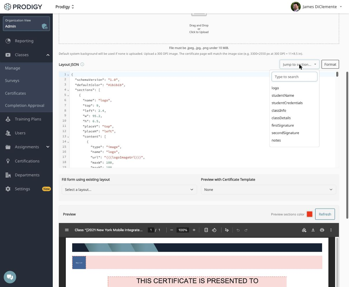
The full reference for what goes in the JSON is in the Layout JSON Reference section below.
Preview
The bottom of the editor has two dropdowns and a live preview.
- Fill form using existing layout - loads the JSON from another layout into the editor. This is the fastest way to start, because you can pull in one of the Prodigy layouts and adjust it rather than writing a layout from nothing.
- Preview with Certificate Template - renders the preview using a real certificate template, so you see the actual logo, signatures, and notes in place instead of placeholders.
Click Refresh to render the preview with sample student and class data. The Preview sections color swatch tints every section box so you can see exactly where each region falls on the page and whether any of them overlap.
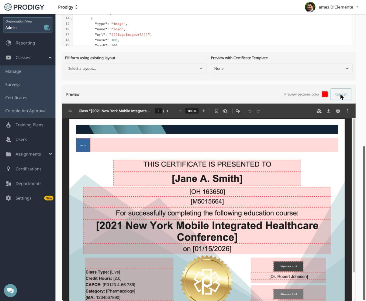
Click Save as Draft to save your work. Back returns to the layout list.
Using a Layout on a Certificate
A layout does nothing until a certificate template points at it. Open the Classes menu, choose Certificates, and click the pencil icon on the template you want to change. The Certificate Layout dropdown sits below the signature fields.
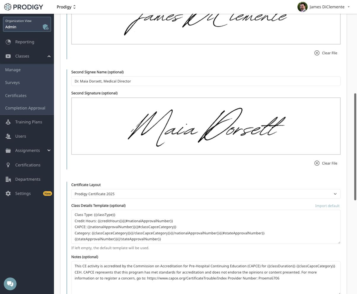
Two fields directly below the dropdown feed content into the layout. Class Details Template builds the label and value block, and Import default fills it with the standard set of class type, credit hours, CAPCE number, and category. Notes holds the fine print, which is typically the CAPCE accreditation statement. Leaving the class details template empty uses the default. The rest of the template form, including logos, signatures, and department access, is covered in Creating Certificate Templates.
Layout JSON Reference
The certificate is a single landscape page, and all positioning is percentage based. Think of the page as a 100 × 100 grid with (0, 0) at the top-left corner. The JSON defines sections, which are rectangular regions on the page, and each section holds one or more content elements.
Top-Level Structure
{
  "schemaVersion": "1.0",
  "defaultColor": "#1b1b1b",
  "sections": [ ]
}
The schemaVersion is always "1.0". The defaultColor sets the fallback text color for any element that does not specify its own. Everything else lives in sections.
Section Properties
- name - Identifier for the section. Any string works, so you are not limited to the standard names.
- top - Vertical position from the top of the page, as a percentage from 0 to 100.
- left - Horizontal position from the left edge, as a percentage.
- w - Width of the section, as a percentage of page width.
- h - Height of the section, as a percentage of page height.
- placeV - Vertical alignment of content within the section:
"top","center", or"bottom". - placeH - Horizontal alignment of content within the section:
"left","center", or"right". - content - Array of the content elements inside the section.
A section written as "top": 50, "left": 25, "w": 50, "h": 20 starts halfway down the page, spans half the width, is centered horizontally, and covers 20 percent of the page height.
Leave yourself margins
Keep at least 2 to 3 percent clear on all four sides so nothing is trimmed when a clinician prints the certificate, and avoid overlapping sections unless you mean to overlap them. Turn on the preview section colors to check both at a glance.
Standard Sections
These are the sections used in the Prodigy layouts. Use all of them, some of them, or none, and add your own with any name you like.
- logo - Organization or certificate logo
- studentName - Clinician's name, usually under a "presented to" label
- studentCredentials - State and national license numbers
- classInfo - Course name, completion date, and the introductory line
- classDetails - Label and value block with credit hours, CAPCE number, and class type
- firstSignature - First signature image and name
- secondSignature - Second signature image and name
- notes - Fine print and disclaimers
Content Type: Text
{
  "type": "text",
  "name": "uniqueName",
  "value": "Display text or {{{templateVariable}}}",
  "fontSize": 20,
  "maxLines": 1,
  "lineHeight": 1.6,
  "alignV": "middle",
  "fontW": "bold",
  "color": "#1b1b1b",
  "border": {
    "side": "bottom",
    "value": "1.6pt solid #222"
  }
}
- fontSize - Size in points. Student names and course names carry the page at 26 to 34, labels and dates read well at 16 to 20, and fine print sits at 10 to 12.
- maxLines - How many lines the text may wrap to. Use 1 for short fields and 2 or 3 for course names that run long.
- lineHeight - Line spacing multiplier, from 1.0 for tight spacing to 1.6 for comfortable reading.
- alignV - Vertical alignment within the text box:
"top","middle", or"bottom". - fontW -
"normal"or"bold". - color - Hex color code.
- border - Optional. The
sidecan be"all","top","bottom","left", or"right", and"none"as the value removes a border. A bottom border is how you draw a signature line or underline a name.
Content Type: Image
{
  "type": "image",
  "name": "imageName",
  "url": "{{{templateVariable}}}",
  "maxW": 100,
  "maxH": 100,
  "margin": "0 auto"
}
- maxW and maxH - Maximum width and height, as a percentage of the section's own dimensions.
- margin - CSS style margin. Use
"0 auto"to center the image horizontally.
Content Type: Label-Value Block
{
  "type": "labelValueBlock",
  "name": "blockName",
  "value": "{{{classDetails}}}",
  "fontSize": 12,
  "lineHeight": 1.5,
  "alignV": "middle",
  "fontW": "normal",
  "labelFontW": "bold",
  "color": "#1b1b1b"
}
This renders the block of label and value pairs, and it is used for class details such as credit hours, CAPCE number, and class type. The labelFontW controls the weight of the label half of each pair, so bold labels against normal values is the usual treatment.
Template Variables
Template variables are replaced with real data when a certificate is generated. Always write them with triple curly braces, and use the names exactly as listed here. The names are fixed by the certificate system and cannot be changed or invented. Adjust the styling and positioning of the sections around them, not the variable names themselves.
{{{logoImageUrl}}}- Organization or certificate logo{{{studentNameValue}}}- The clinician's full name{{{studentStateLicense}}}- State license information{{{studentNationalLicense}}}- National registry information{{{classLongName}}}- Full course name{{{completionDate}}}- Date the course was completed{{{classDetails}}}- The label and value block of class details{{{firstSignatureImageUrl}}}- First signature image{{{firstSignatureName}}}- First signer's name and title{{{secondSignatureImageUrl}}}- Second signature image{{{secondSignatureName}}}- Second signer's name and title{{{notes}}}- Additional notes or disclaimers
You do not have to use all of them. If your design has no second signature or does not print credentials, leave those sections out entirely.
A Worked Section
This is the logo section from a Prodigy layout, positioned near the top of the page and aligned to the left.
{
  "name": "logo",
  "top": 9,
  "left": 2.4,
  "w": 95.2,
  "h": 6.5,
  "placeV": "top",
  "placeH": "left",
  "content": [
    {
      "type": "image",
      "name": "logo",
      "url": "{{{logoImageUrl}}}",
      "maxW": 100,
      "maxH": 100,
      "margin": "0 auto"
    }
  ]
}
Fonts are not set in the JSON
The layout JSON controls size, weight, and color, but not the font family. Font family comes from the certificate rendering system, so a layout cannot switch typefaces.
Suggested Workflow
Start by choosing an existing layout in Fill form using existing layout so you begin from a working document rather than a blank editor. Adjust the section positions to match your design, then click Refresh with the section colors turned on to see where every region lands. Once the boxes sit where you want them, choose a real template in Preview with Certificate Template to check the design with your actual logo and signatures. Save as draft along the way, and contact support when the layout is ready to be published.